
So... the question has to be asked: what possessed the TransFormers Collectors' Club to choose Machine Wars as the theme of it's 2013 BotCon set? And how would such a tiny selection of characters be represented? Well, amusingly, it seems that they ignored what little story Hasbro might have crafted (though they probably didn't) and created their own take on the mini-line...
Packaging:
Depending on your point of view, the Club did something clever and amusing or just their usual thing with an in-joke that sorta backfires. Basically, the boxed set comes in packaging based very closely on that of the old Machine Wars toyline, with artwork of the main character in the set, Obsidian - looking brilliant, rendered in a sort of high-quality comic book style, if not quite the style of the MW packaging - and a plastic window in the box, lined with a yellow glow, and showing through to the contents of the box. The logos are a very good approximation of the original Machine Wars logo - rendered in the old Beast Wars font, with a yellow-to-orange gradient and a solid black drop shadow. The TransFormers logo matches that of the Machine Wars era and carries the Club's usual Timelines subtitle. It's also the usual sturdy card with excellent print quality and a nice glossy front, which is always a pleasure to see.
Although the box contains five models, the box-out on the lefthand side of the window only includes a list of the characters within, rather than showing a photo of any - or all - of the robot modes. It might have been nice to have artwork of all the characters rather than just Obsidian, but he is the main player in the set, and it's not as if the artwork would be free - an artist, inker and colourist would need to be paid, and that would have bumped up the cost of the set further...
...Which brings me to the in-joke that sorta backfires: the price label they added to the box (and it is a label, not part of the main artwork). It's styled after a certain American toy shop's price label, and includes the opening date of BotCon 2013 as well as a 'discounted' price of $365.00, down from $999.00... and that's the rather galling part. At $365, it was the most expensive BotCon set to date, so the 'joke' of it being presented as discounted was rather less funny for the punters than it was for FunPub.
All that aside, it was nice to see that FunPub had finally corrected the typo in their self-publicity on the side of the box.
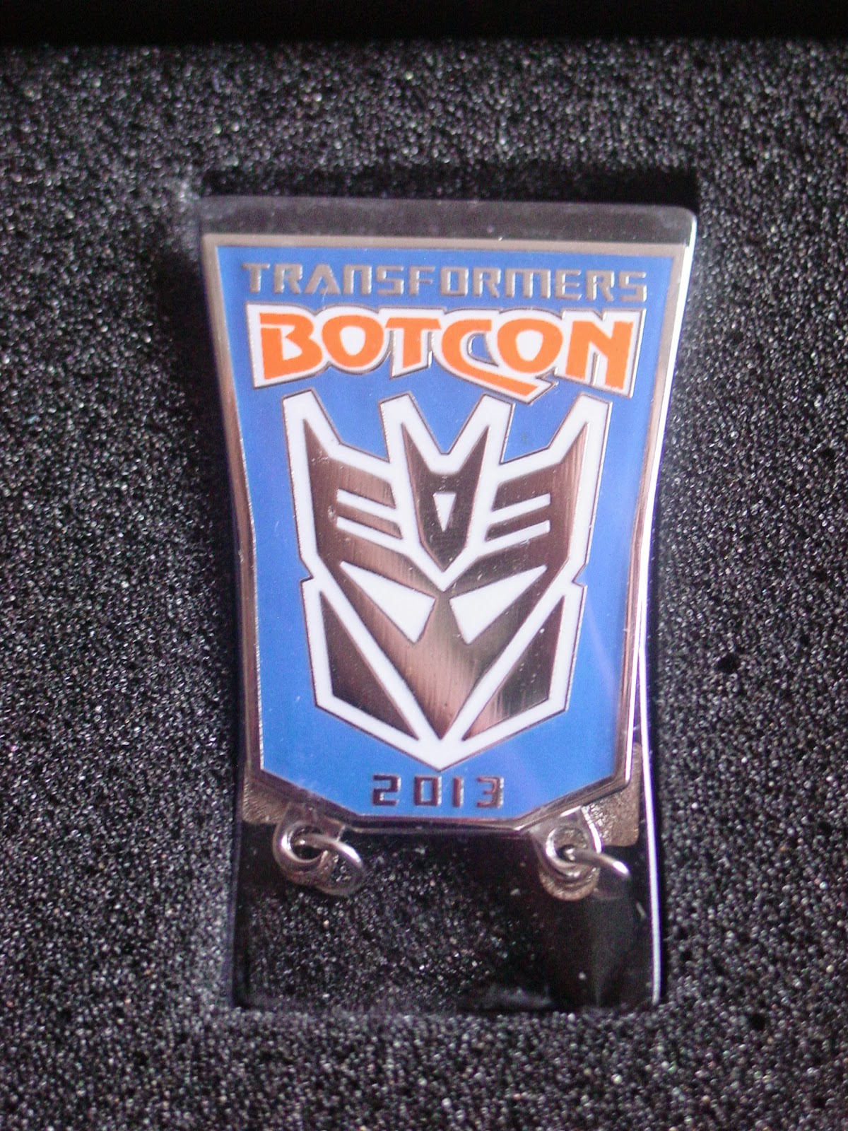
Inside, the five figures - three Deluxes, two Voyagers - are packaged securely in the Club's usual grey foam, with the enamel badge nicely sheathed in a protective plastic bubble, the weapons in their own compartments, as well as the usual comic and certificate. It was disappointing to find that Megaplex did not come with either Skyquake or Dreadwing's Poweriser weapon, especially considering Machine Wars Megaplex was packaged with a gun, not a sword.
There's also the usual bio cards and the BotCon programme/comic, all with a very peculiar art style, similar to TransFormers animated, but even more angular and exaggerated.The comic is a surprisingly good read right up until the last couple of pages where the story is somewhat derailed by a jarring plot twist that comes with no foreshadowing (except perhaps in the bio cards). Most of the story focuses of Obsidian leading a ramshackle band of liberation fighters against Megaplex, who wants to 'purge' Cybertron (no reason is given for this as far as I can tell, other than essentially "he's gradually turning into Megatron"). There's some great dialogue and a hint of anti-cloning philosophy from Megaplex (is it just me, or does the subject of cloning come up in several BotCon sets?) but then, all of a sudden, a new antagonist is thrown in right at the end, creating a situation where the whole preceding story becomes more or less irrelevant... And there was no attendee exclusive figure of this 'key' character. I like the way the story played about with the fact that several figures were not packaged with the 'right' weapon, yet some instances ("What would a Megatron be without a fusion cannon?") which were irksome, portraying characters using weapons that weren't even available as extras, let alone in the boxed set.
The bios are the usual mix of lax grammar and FunPub's creative approach to punctuation, but some are better than others at detailing character, armaments and abilities. The standout poor bio has to be Skywarp's, which paints him as an idiotic prankster who somehow got command of some troops... which, by extension, makes Megaplex a bit of an idiot.


But, really, who gives a crap about the box and the silly extras? Let's take a look at the toys
Hoist
Vehicle Mode:
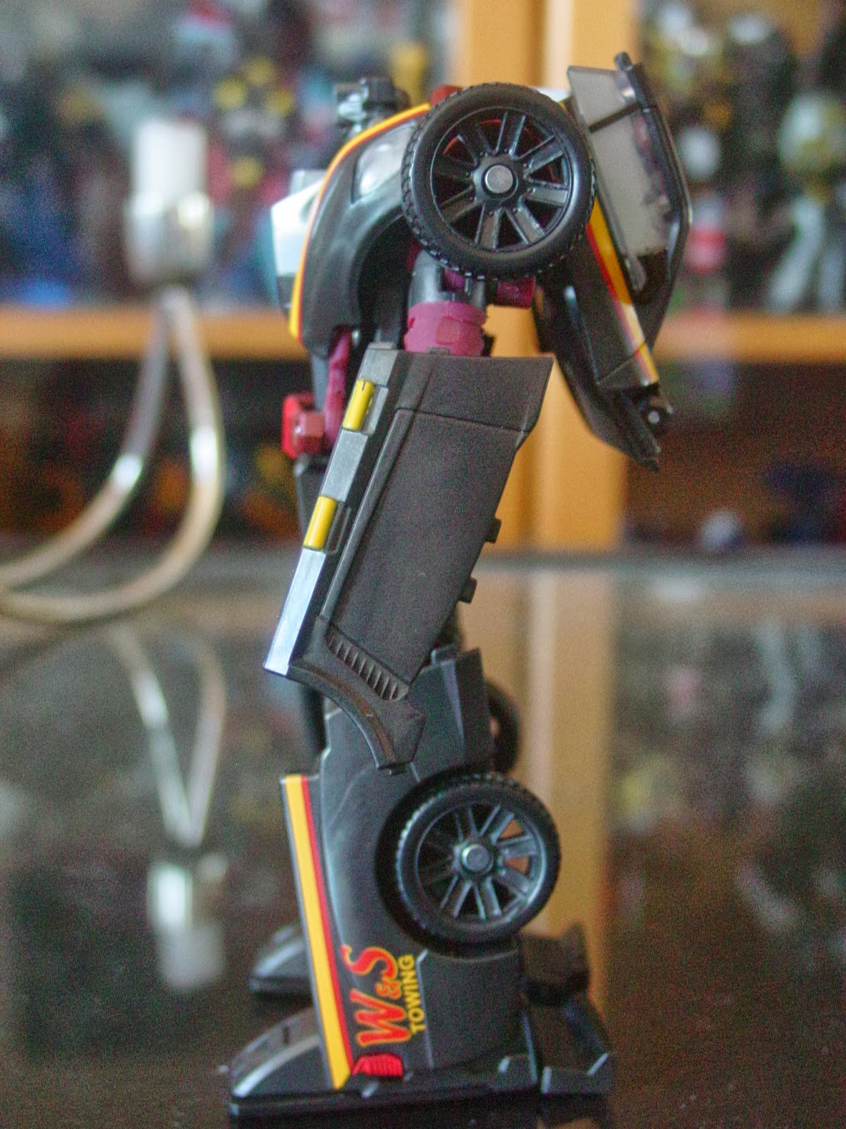
The first figure in the set is a repaint of Classics/Generations 'Sergeant' Kup, coloured as per Machine Wars Hoist. He's molded mostly in a very dark charcoal grey with a slight sparkly component, with yellow and red stripes running down his side, and a 'W&S Towing' logo stamped onto the sides of the truck bed. His headlights and tail lights got some paint and, curiously, all the windows have been painted silver on the inside. This does match the original toy, but that had opaque 'windows', so this feels like a waste of either silver paint or transparent plastic. The outer corners of the bumper have been painted red, with their lights picked out in yellow, while the rear lights got a coating of red. It seems strange that the central part of the bumper - and the grille for that matter - were left unpainted but that is also true to the original. Similarly, the hubcaps are unpainted because that's how they are on the original... or perhaps because all the silver paint was used unnecessarily on the windows. The two touches of yellow below the car doors on each side are just baffling, though.
It's a good, solid vehicle mode on which the seams break the surface of the truck in some quite alarming ways, almost seeming to deliberately steer clear of the natural seams of the vehicle. While the original Hoist - both G1 and Machine Wars - was a tow-truck of sorts, this is merely a pickup truck... and a distinctly retro one, at that. Not to say it's not a good choice of mold - and it's not as if there were many other options outside of the movie line, which has already done a G1 Hoist homage - but perhaps Hoist was the wrong character to include in the set..?


Robot Mode:
And now it becomes clear that one of the reasons this character was chosen for the boxed set via its remolded head, which isn't quite the rounded bonce that Machine Wars Hoist had... In fact, bar the circular details on the forehead, this sculpt is more of a homage to G2 Laser Rod Electro... so it comes as no surprise that this mold was recoloured as Timelines 'Electrons', an attendee exclusive additional figure. This kind of makes Hoist the most blatantly cynical addition to a boxed set since... [swiftly researches BotCon exclusives from 2005 onwards] ...Well, I guess this sort of thing happens almost every year with BotCon sets, doesn't it? The head isn't bad, though it kind of looks to me like Spider-Man Noir wearing a boxy crown and large triangular earrings.
What puzzles me most about this as an updated MW Hoist is that the paint job has been designed to emulate the original's split windscreen chest - that is, a single panel has been painted with two separate blocks of silver in an attempt to make it look split - which doesn't make sense when vehicle mode doesn't have a split windscreen. Even the clear faux windscreen piece above it has been painted over in silver, which seems like a huge waste considering the hubcaps and grille were in greater need of paint to make this look 'premium'. Other than that, there's not much new paintwork - a yellow blob outlined in red for his 'belt buckle' and patches of red and yellow on his shins - with the rest of the colour coming from burgundy plastic. Hoist has no visible faction insignia, but I presume he's still the Autobot version...
Naturally, he comes with Kup's musket, which is a decent weapon, though the stock is a bit too long and can get in the way when he bends his elbows. When not in use, it can attach to one of the two c-clip points on his backpack and, thanks to a ball joint, angled according to preference.
There was a massive quality control problem with almost every single Hoist (and Electrons) figure, in that the charcoal-coloured shoulder pieces were attached to the wrong shoulders, meaning Hoist's arms cannot hang straight down. Fixing the issue is simple enough, but requires tools I don't currently own to remove a metal pin from each shoulder to allow them to be swapped. A second issue, the misassembly of the central part of the torso, meant that he would not fully transform into robot mode, but fixing that required only a screwdriver. Hoist isn't a major player for me, so I'm not overly fussed by the QC issues, but it is a major gaffe considering the expense of the set.
Taking into account the QC issues, the way the head sculpt was designed primarily for the other usage of the mold, and the substantially less than premium paint job, it's pretty clear that Hoist is the duffer of the pack.


Skywarp
Vehicle Mode:
Based on the Revenge of the Fallen Dirge mold, this model was one of the reasons I decided to pick up the set. It's based on the Hawker Siddeley Harrier Jump Jet (one of my favourite fighter planes for no reason other than it's a British-made VTOL jet that looks rather cute), but that wasn't quite enough to interest me in the mold when it originally came out. Sure, that might have been cheaper, but nothing about the figure really seemed to suit Dirge (the G1 character)... So this exclusive is my first experience of the mold!
It's actually rather good, too... though it's not entirely accurate. The intakes at the front are rather wider than those of a real Harrier, the tail is divided into two large, angled fins on the top and two smaller angled find on the underside, and the wings have a few extra angles to them, so the striking form of the Harrier has been made even more striking. Like just about all TransFormers aircraft, there's a certain amount of robot undercarriage visible, but it's lower-profile than average and, with the missile pods attached to the wings, all but invisible from most angles.
Then the colourscheme is completely outstanding - the plane is a pearlescent white for the most part, but the extremities of the wings and the missile pods are in translucent purple, representing Skywarp mid-teleport, with the border between the two states highlighted by a jagged, pixellated black line (slightly misaligned on the tail fins). Additionally, Skywarp has some red detailing on the wings, fins and fuselage. This is very definitely not the Skywarp we know from Generation 1, but it's a fantastic, imaginative update to the Machine Wars Cyberjet.
The aforementioned missile pods are probably a bit oversized for a jet like this, but they look awesome attached to his wings and, as mentioned, help disguise bits of the robot. The spring-loaded launchers are translucent purple, but the missiles are white, making for quite an interesting contrast.


Robot Mode:
This being a bizarrely asymmetrical robot mode, you'd think it'd be right up my street... and you'd be correct. One of the things that put me off the mass-released versions was the head sculpt with its rather ugly spin on the 'Conehead' concept. Utterly cured of this affliction, with a newly-sculpted and very yellow head, Skywarp still looks pretty weird in robot mode, but it's an acceptable form of weird.
I don't know why but, looking at these photos now, Skywarp makes me think of Buzz Lightyear - it could be the barrel chest (which, amusingly, has a couple of Mech Alive spinny gears that rotate along with his shoulder movement), the broad shoulders and the comparatively skinny legs. The red stripes and markings could also be part of it... He definitely looks like some kind of space hero. There's an awful lot of molded detail in the torso, but so much of it lost due to minimal paintwork (thanks to all that translucent purple needing to be covered up) and the stark pearlescent white plastic. Thankfully, the intricate details are more apparent on other versions of this mold.
The spring-loaded missile pods plug into his arms, just like they should on any good Seeker, but even that is asymmetrical - on the nose arm, it plugs into the forearm, on the other, it plugs in just above the elbow. In practice, it doesn't make much difference, but it does look a little strange.
The head sculpt is based closely on the Machine Wars Skywarp head, but with the details emphasized and the light-piped visor replaced with silver paint. The head seems far too small for the body - odd, given the Dirge/Jetblade use of the mold had such a large noggin, it had to transform slightly to fit inside the torso in jet mode.
This is a weird, gangly robot with an absolute mess of joints for legs and awkwardly constructed arms, but the mid-warp effect - while designed mainly for jet mode - is such a cool feature, I'm inclined to forgive almost anything... and owning this more recently convinced me to pick up the attendee exclusive Thundercracker repaint in one of the Club's sales. I hadn't expected much from this figure, but it turned out to be one of my favourites.


Strika
Vehicle Mode:
Originally more from Beast Machines than Machine Wars, Strika is described as Obsidian's "consort" and so there would surely have been an outcry if the BotCon set included one without the other. The original transformed from a grotesque six-wheeled 'tank' into an even more grotesque, hunchbacked, stick-legged robot potato. The Classics/Generations Warpath mold has a lot to offer, despite being one of those weird H-Tanks that plague the TransFormers brand. Aiming for a TV show styling, she's molded largely in purple plastic with lots of yellow paint dotted around but, unlike the TV show, it's all really bright and clean. The front of the turret has a black and silver 'grille' design that doesn't even attempt to follow the details of the molding. The tank tread sections are all painted black, so they stand out quite nicely against the purple.
The fact that she has Autobot insignias stamped on the armour around her front treads suggests that this must be the pre-Beast Machines Strika, whose loyalty was to Cybertron rather than to any particular ideology and was therefore considered broadly 'one of the good guys'.
For me, this is a perfectly acceptable and appropriate alternate mode for Strika. The only downside to this is how bright the purple is - surely something closer to Shockwave/Skywarp/Constructicon purple would have been better, and with gold paint rather than yellow? Still, it's a tank that looks like a tank and we should probably be glad of that.


Robot Mode:
Of all the molds the Club could have picked for Strika, this is probably the most fitting in robot mode. The only better option I could come up with in recent years would be the TF Prime Breakdown mold (wouldn't that be something!) even though that's a van rather than a tank, because it could easily pass for a SWAT vehicle. It's a shame she's now dwarfed by Voyager class Obsidian, but the largest likely tank bot, movie Bludgeon, had only been used the year before as Gigatron and just wouldn't have been suitable for Strika. Despite her diminutive stature, proportionally, she's still good and bulky, but now has larger, more powerful legs and feet to better fit the upper body. It's also an amusing coincidence that the Warpath mold has forearms large enough to hark back to the original Strika's weird forearm flaps which had spindly hands inside them. This mold used as Strika serves as clear, irrefutable proof that a Femme-Bot doesn't need robo-tits.
The balance of colour is much improved in this mode, though unfortunately that means more yellow paint as well as more visible greyish plastic. The bluish metallic paint on her shoulders wasn't visible in tank mode, but definitely helps to improve the look of the upper torso, covering up so much of the purple plastic. While it's nowhere near a match to the bluish grey plastic of her biceps and thighs, it complements it well enough.
The new head sculpt for this figure is not bad, but for some reason seems to have placed greater emphasis on the gas mask-like face than the yellow/gold crest on the back of her head. The original - both in toy form and in the Beast Machines TV show, looked like an exaggerated robotic hybrid of Margaret Thatcher and Brigitte Nielsen around the mid-1980s, while the swept-back 'blonde' crest on this is truncated and flattened out a bit too much (though this was 'corrected' in the artwork for the accompanying comic). It's all to to ensure it fits inside the chest for transformation, so it's perfectly understandable, but nevertheless disappointing. The paintwork, too, is a little sub-par, with the yellow paint covering only the upper surface of her 'crest' and a couple of perfunctory purple stripes on her cheeks. The tech detailing sculpted into the top of her forehead and the protrusions from her jaw could have used some paint to make them a bit more interesting, and the eyes seem a little beady... possibly just too close together.


Megaplex
Vehicle Mode:
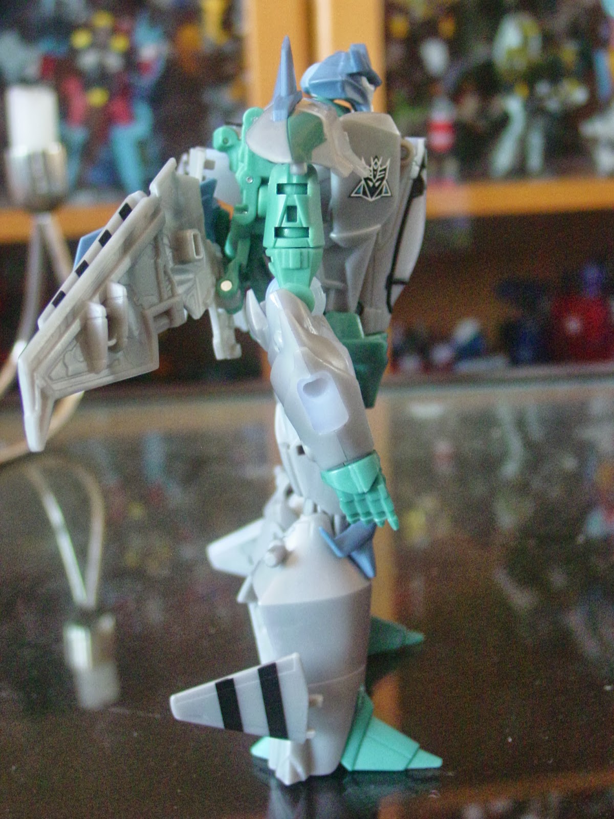
And here's one of the contentious models in the set - a repaint of TF Prime Skyquake/Dreadwind as Machine Wars Cyberjet Megatron's clone. There was some kind of mixup between Machine Wars Megatron and Megaplex, however, and it seems likely that the grey jet was supposed to be Megatron.
Either way, this is a far more thoroughly decorated jet versus the MW original because this actually features pretty much all the paint of the original, plus a lot more, and uses more than one colour of plastic for the jet parts. The bulk of the jet is molded in a pearlescent grey - instantly more appealing than the dull, flat grey they probably could have got away with using - with much of the paint budget apparently going in the bold, glossy black stripes on wings and the stabiliser wings at the back. While there aren't many applications of detail paint - only a small touch of silver behind the cockpit, but no paint leading up to the afterburner the way Skyquake and Dreadwind were done - there are a couple of uses of matte black - framing the cockpit, a block roughly in the middle of the jet and the afterburner itself. The rubber sections are molded in a pastel blue, while many of the mobile robot parts are a sort of tealish colour (much darker than it appears in my photos and matching the painted patches either side of the cockpit) and the translucent parts - previously intended to service an LED gimmick that wasn't included in this set - are a strange, cloudy pastel blue, very similar to the rubber parts.
The thing with a lot of repaints is that, ultimately, they look pretty much the same as the original... I'm not sure how, exactly, but Megaplex looks very different to Skyquake and Dreadwind. Maybe it's just because the bulk of his parts are in a light, neutral plastic, with the remainder being darker, cool, contrasting colours - almost the opposite to the TF Prime jet brothers, and almost passable as real-world jet colours... and it's not often one can say that about a TransFormers jet.
Since the only weapon included for Megaplex is the sword that came with Skyquake and Dreadwind, he's distinctly underarmed in jet mode... He really needed something else to mount as a weapon, either behind the cockpit or on the wings.


Robot Mode:
The big whinge about this figure was that it didn't get a new, more Megatron-like head sculpt. Thing is, going by the packaging artwork, the original Megaplex wasn't supposed to have a Megatron-like head, and Skyquake/Dreadwing's helmet looks like a somewhat exaggerated, very TF Prime-style version of the head depicted in the artwork (see TFWiki). It's molded in the same pastel blue rubber as the tailfins, kneecaps and the little wings on his shoulderpads, with the face painted in a stark, skeletal white.
The cloudy translucent pale blue parts actually blend surprisingly well with the pearlescent grey in robot mode, so the arms don't immediately appear to have any incongruously coloured sections. I have to say, though, despite the nice contrast of the grey with the tealish and pastel blue parts, Megaplex looks rather plain in robot mode, since virtually all the striping is on his back and there wasn't much other paintwork to begin with. All he really has is a couple of Decepticon insignias on his chest, in case there was any doubt as to his allegiance.
In this set, Megaplex comes packaged with the same sword as Skyquake/Dreadwind but, sadly, neither of their guns. I could understand if the LED gimmick had been removed to cut costs (battery-operated gimmicks having been stripped from several other BotCon figures in the past), but it's more than a little disappointing that neither one of the the spring-loaded Poweriser weapons - poorly executed though they were - were included. What's most annoying about the lack of the Poweriser weapon is that, in the comic, Megaplex is depicted using a weapon that is described as a fusion cannon (though it looks suspiciously like the white repaint of Arms Micron Magi, named Scalpel, packaged with BotCon 2015 Megatron). This is probably my biggest complaint about BotCon/Club fiction overall - that they include things in the story without making the equivalent figure/weapon available at the show or via the Club shop.
Given that Megaplex was originally a fairly basic G2 Cyberjet, I wouldn't necessarily have thought of this as an ideal mold, but it's suitably bulky for a Megatron clone. The only real downside is that, using the original head, it doesn't fit the aesthetic of the rest of the set which, while it does cross continuities, remains otherwise broadly realistic and reasonably consistent.


Obsidian
Vehicle Mode:
I mentioned in my write-up of Hunt for the Decepticons Highbrow that I like quirky, and this propeller-driven beauty is certainly one of the quirkiest aircraft Hasbro/Takara Tomy have ever produced (only outquirked by Mastermind Creations' Knight Morpher Seekers), and now it's been repainted and given a new head to represent the quirky-to-the-point-of-being-rubbish Beast Machines figure.
While early Photoshopped images of Timelines Obsidian used the vibrant greens of his original toy, the final version uses more muted tones, supposedly in reference to the character's appearance in the TV show. On the upside, this means he's not an eye-searing, acidic green but, on the downside, it means he's not hugely different in colour to Highbrow - the most obvious differences being the washed-out red propellers and the scarlet nose on the central fuselage. The nose also has a few details - including the covered machine guns - highlighted in yellow and the same paint is used for the three stripes around the cockpit area. Oddly, the engines are painted green to match most of the underside.
I was glad to see that Obsidian retained the Gatling guns from the original use of this mold, but not so glad to see a prominent stress mark on the tail section, where a pin seems to have been forced through the plastic having been improperly lined up. So far, it hasn't worsened, but I'm keeping an eye on it.


Robot Mode:
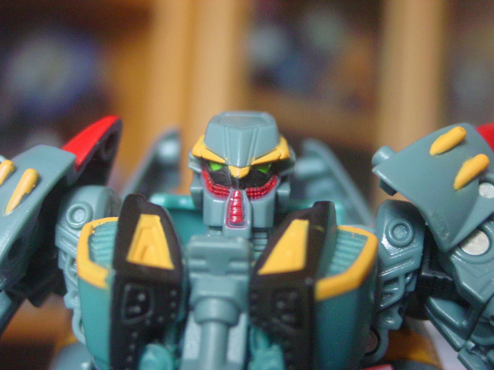
Words cannot adequately express how much I love this mold as Obsidian, despite it being a very strange choice, given it's WWII stylings. The original toy was one of those horrific Beast Machines/Machine Wars messes that looked nothing like the character in the TV show, so it's one of many toys I've never bothered tracking down. However, the character was quite an important - albeit rather late - addition to the cast of the Beast Machines TV series, so I've always wanted a worthwhile version of Obsidian in my collection, and the fact that the colourscheme is truer to the CGI from the TV show rather than the original toy is a huge bonus.
The balance of colour is a bit odd in robot mode, with the upper body getting virtually all the paint, while the lower body is, if not entirely bare plastic, then painted only subtly - the shins are the darker green of the plane's underside, there's the tailfin red on the inside of the inner 'toe', and then the only other colour is from the yellow strut of the landing gear. The hips really could have used a touch of paint right on the joint detailing, though the sculpted inner workings don't get lost without. The rest of the torso gets a generous coating of both black and yellow paint and, with landing gear in the centre of the chest, there's almost the illusion of more colour that there really is.
Some of the paintwork, I have to say, is a little sloppy... but that's kind of par for the course these days, unfortunately. In places, the edges are feathered, in others the paint doesn't line up with the detail it's meant to have been applied to. Not great on the main player in a premium boxed set, but I've certainly seen worse.
If I had a proper gripe, it would be that the head sculpt gets the balance wrong between the black space under his eyes, the red patterned strips below that, and the bottom part of his helmet - the concept art was good, so it's just the end sculpt that's gone a bit adrift. It also suffers from the frequent malady of Club/BotCon figures, in that the head sits too far back on the neck, so his chin barely protrudes past the front of his neck, while the back of his head seems to stick out rather more. I also find that the groin doesn't peg together as tightly as Highbrow's, leaving a slight gap between the two halves, but it's not prone to popping apart, so that's not too bad.
Along with the poorly pinned bit of tail section, there's a minor QC issue that becomes apparent in robot mode, in that one of the small wings (now on his hips) is somehow misaligned such that it can't swing all the way down, and it looks as though his right hand was touched by something hot as there's a small, melted-looking patch right on one corner of the fist.
I've seen fan-made Photoshop images of Obsidian made using the Reveal the Shield Lugnut mold and, while I think that could have been excellent, I genuinely prefer this as Obsidian - he looks quick and dangerous in both modes, where Lugnut is a hulking brute of a mold. This version may not scale well with Timelines Strika, above, but Lugnut wouldn't have been much better... and surely Obsidian is meant to be smaller than Strika?


Despite having a low opinion of both Beast Machines and Machine Wars as toylines, I was very enthusiastic about this set almost from the moment it was first announced, and certainly when the first images of Obsidian emerged. The fact that one of the figures in the set was critically misassembled is somewhat offset by the fact that it's the least interesting figure in the set anyway, and the discovery that the Skywarp mold was actually pretty damned good after all, but there's no escaping the fact that the quality control issues on this set reduced its overall impact. That these QC issues occurred in what was, at the time, the most expensive BotCon set ever is almost inexcusable.
Fun Publications were clearly trying to accomplish something with this set, but it feels as though they missed the mark on several counts. It's not a bad set, by a long shot, but it's rather average at best, and the attendee exclusive extras were desperately underachieving (how many Mirage figures does the Club think we need? Seriously, you could build an army out of him and Breakdown alone! And did we really need three more background Seekers?) despite the pleasant surprise of Sandstorm made from movie Skyhammer, Terradive repainted as MW Starscream and what could have been an awesome Obsidian.
Similarly, the comic could have been one of the best were it not for the ridiculous and abrupt 'twist' ending. There always seems to be something a bit off with the BotCon comics, and they seem to keep making the same sorts of mistakes, leaving all their stories feeling unfinished... and rarely following them up with anything substantial. Which is odd, considering they've been at this for a little over a decade now...
So, overall, the potential of this set is sadly unrealised, but it's still pretty decent aside from Hoist. I think, in retrospect, I could probably have done better by tracking down Obsidian separately rather than ordering the Iacon ticket for 2013's BotCon. Granted, I wouldn't have discovered how cool the movie Harrier mold is as Skywarp, but I don't think that would have bothered me overly.
Wow, I saw one of these box sets in Osaka the other day, and was shocked at the price tag with 999.00 price on it. Totally didn't realise it was a joke. I guess it just shows how America centred the club was. Personally I had little interest in this set. Although I do like the paint on Skywarp, the mid-warp thing is s clever idea!
ReplyDeleteThat really shows what a poor joke it was on FunPub's part: they clearly didn't consider what might happen when the boxed set made its way into the wild in the secondary market. A 'joke' like that should have been part of the box art rather than an actual sticker on the box but, even then, it wouldn't have been especially funny.
DeleteI'm surprised the Club don't do more figures like mid-warp Skywarp - Games of Deception Mirage might have been fun like that, rather than all translucent blue - but I guess there aren't that many characters for whom that kind of effect is appropriate...