The funny thing about the original Revenge of the Fallen Sideways toy was
that, in spite of its inaccuracy - both in robot mode and vehicle mode - I
enjoyed it so much that I ended up buying its two repaints - Dead End and Movie Advanced Dino - both of which I
enjoyed every bit as much as the original.
However, it can't be argued that Sideways wasn't in serious need of a do-over, so the announcement of a Studio Series version was great news. What wasn't so great was that, once again, Audi had declined to grant Hasbro the licence to reproduce their car (one has to wonder why they ever agreed to have one of their vehicles appear in the movie franchise in the first place - what did they think they were getting themselves into?), so he's still not an authetic Audi R8.
Still, with expectations suitably adjusted and allowances made, let's see how the new version of Sideways compares to the version from 2009's Revenge of the Fallen toyline.
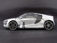
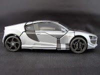
Despite the lack of a fully licensed vehicle mode, Hasbro and Takara Tomy's designers have, once again, delivered enough of the impression of an Audi, along with specific details that are suggestive of the R8. The overall form of the vehicle is good enough that, since I've not watched Revenge of the Fallen since I cruelly subjected my girlfriend to its particular brand of atrocity some time after she moved in with me, it looks pretty much spot on to me, at least from the front. The back end is too tall and stubby, but the details are fairly similar to various models of Audi, differing mainly in their proportions. It's also worth noting that this one one of the very few occasions where Hasbro have deigned to paint the tail lights, so that's one big mark in the toy's favour. For some reason, when I look at the back end of Sideways, I see the face of a very happy robot with buck teeth. The car sculpt overall is very tidy and, while a couple of the robot's fingers are visible at the back, poking out below the rear bumper, they blend in pretty well.
I'm also very impressed by the way the headlights have been sculpted. One of the details fudged on the 2009 toy was the position and prominence of the main headlights. There, the larger, rounder lights were placed toward the inner edges, closest to the grille. Here, they're back on the outer edges... and the really clever part is that their position has been used to accommodate the pins for a couple of transformation hinges. The holes go in the wrong direction, technically - inward, rather than back - but they're cut out of the vehicle's front wings in a way that looks broadly correct from the front. All that's missing is a translucent plastic shell over the top - I always find bare plastic to be a cheap and ugly means of portraying headlights, and painted plastic is frequently not much better.
And herein lies the first major problem with this toy. While the use of silver paint on the bodywork is about as good as anyone could hope for - both on the opaque and the translucent plastic sections - and more accurately represents the way the R8 looked in the opening scenes of Revenge of the Fallen, the plastic used for the car shell is a flat, dull grey. If the intention was to suggest, for example, a carbon fibre bonnet, they missed that by a mile... But Sideways in the movie was mostly silver and glossy black, with panels of matte black on the sides. What we've got here is great as far as the silver goes, but the exposed grey plastic is the very definition of 'meh'. It's bad enough that a couple of chunks of this are visible on the sides, where the plastic used for specific parts is the type that - apparently - doesn't accept paint, but then the wheels are molded in exactly the same plastic. That they were able to closely match the plastic colour with the paint used on the translucent sections of roof and the side window/door sections is surely admirable... but it's still a dull, crappy-looking colour... and even the inclusion of the silver linework running from the front of the bonnet to the back of the car doesn't change that.
Making matters worse is the weapon storage. Sideways wasn't even shown to be armed in Revenge of the Fallen, so the fact that the included weapon can only tab onto the back of the car, via slots either side of his exhaust pipes, looks all the more ridiculous. Granted, there's no space left over inside the vehicle mode, and trying to mount it over the roof, the way a lot of these toys still do, wouldn't have been any better... Such a bulky weapon was never going to look good as a tacked-on addition.




Robot Mode:
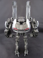
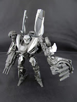
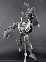
Awkward-looking as the Revenge of the Fallen toy was, this new version still looks all kinds of bizarre. He's much more hunched over, albeit with a far tidier backpack that doesn't stick out anywhere near as far. His arms are still massively oversized - perhaps even moreso than those of the 2009 toy - and, while his legs aren't so widely spaced at the hips, they still seem undersized for the rest of him... The movie Decepticons tended to have weirder, less traditionally humanoid proportions than the Autobots (at least until Hound came along), and Sideways certainly reflects that, despite being ostensibly one of the more 'normal-looking' ones. There's a certain gremlin-like quality to his overall appearance.
As much as I complained about vehicle mode looking dull because of all that grey plastic, robot mode ends up looking a lot worse, on balance, because so much less of the silver is visible, and the only other paint colour - red - isn't used anywhere on robot mode. Aside from the leftover vehicle parts on his chest and arms, the only paint applications specific to robot mode are on the forearms, thighs and shins. There's a fair amount of sculpted detail on the outward-facing parts of his arms and legs and, to be fair, all of that looks fantastic. The forearms do suffer a little from having the car panels on the outsides, but the unusual shape of them - partially due to the way the hands compress down into the forearm, bringing the vehicle's back wheels with them - helps prevent them from looking too squared-off. The legs are, for the most part, very nicely done, with an awkward shape all their own and some very cool details, but at least some of it should have been painted silver according to the CGI and concept art.
The problem isn't a lack of detail, or even that the dull grey plastic swallows it all (though it does look somewhat softened due to the matte texture), it's just that predominance of a single shade of grey. Had the vehicle shell been molded in black plastic, that alone would have improved the overall look of robot mode... but the only differences in tone and shade come from how the figure is lit. A few more touches of silver or red paint, just to highlight more of the sculpted detail, would have done wonders, but it's that lack of contrast that makes him look cheap and unfinished. Sculpted details like the spikes protruding from the faux-tyres on his cuffs really should have been painted, and any additional paint on the upper arms would have been an improvement.
But then, once you really start to examine Sideways, and see where all the detail ends abruptly, giving way to gaping chasms in the plastic, it only looks worse. Just behind the hands, the forearms are empty - almost like those figures where the hands fold into the forearms, leaving gaping holes in robot mode - and the entire upper arm is hollow at the back. Similarly, while the legs look fantastic from the outside, the inner faces are both concave and almost entirely bereft of detail but for the structural supports. Much of this is clearly a necessity of how the legs wrap around the robot's inner core in vehicle mode, but it ends up looking as though there are parts missing... The shin spike hanging down from the knee could likely have been made hollow at the back, but instead it has three sections cut out of it on the inner face, and the paintwork only covers the complete outer face.
And while he looks broadly accurate to the CGI overall, some of the specifics are completely wrong. The front wings tilt downward, when they're supposed to rotate upward, as if part of the shoulder assembly itself. It's also supposed to split in two, such that the section of grey bonnet stands up at a steeper angle. There's also the car's side windows, rising up like wings behind his head, which are supposed to be rotated inward such that the windows themselves face forward... Though I'm honestly not so fussed about that particular detail. Had they even just slid inward, so that they were closer together, than would have been satisfactory.
Sideways' weapon features the standard 5mm peg, but I have no idea why. Even in robot mode, it stores in exactly the same place, and by exactly the same method as in vehicle mode, and there's not a single 5mm port on him. Strange as it may be, the way Sideways wields it is pretty cool. Rather than being a partial 'glove' that pegs into a 5mm grip fist, like we've seen on some of the more recent iterations of Bumblebee, he slots his fingers into the back of the gun, which is then secured in place by wrapping the thumb around a tab on the outside of the gun. This works on either hand, as well, since the body of the gun is symmetrical. The weapon itself is a little blocky and nondescript - with no paintwork at all - but my main complaint about it is that it adds so much extra length to arms that already seem disproportionately long. I gather the gun was taken from the Revenge of the Fallen videogames, since Sideways didn't even defend himself in the movie, let alone attack any of the Autobots... And, while it may be nice to have such accessories, I can't help but think the extra budget would have been far better spent on additional paintwork for the main figure.
On the upside, the head sculpt is great - another fearsome, vaguely insectoid Decepticon visage, somewhere between Barricade and Blackout in appearance, but painted almost entirely silver. It's one of those designs that people either love or hate, because it's so very alien, with plenty of detail but no discernible (humanoid) features. Personally, I actually liked most of the Decepticon head designs from the first handful of Michael Bay movies (with the exception of Megatron) and, while Sideways doesn't look unique or especially distinctive, I do like the look. What really surprised me about this one is that it was designed for light piping - the entire back of the head is translucent plastic - but the tiny, beady, sunken eyes have been painted over... with opaque burgundy paint, so they're barely visible.





Sideways has a transformation that feels somewhat behind the times when compared with other recent Studio Series releases. If he'd been released in the first couple of years of the toyline, I might have liked it more but, coming after the likes of Stinger and pretty much any figure from the Bumblebee movie, he feels surprisingly basic and unimaginative. Much like the original toy, the first step is essentially a case of unfurling the vehicle mode shell and tabbing it together. After that, it's basically robo-yoga for his legs - wrapping them around and pegging them to the robot's 'spine' - and pegging the feet together over his head, then straightening his arms and getting him to grab his own backside before straightening up the front wings and flattening out the grille. The only complicated part is getting the arms properly tabbed into the rest of the vehicle shell. I've seen lots of photos of the car mode with the central part of the bonnet not tabbed in properly, so it sticks up slightly, but it pops in very securely - it just needs a more forceful push than one might expect, resulting in a distinct 'click' as it finds its place. My main problem is that the forearms seem slightly too bulky, so they never quite line up flush with the side window sections... and the silver paint exacerbates this by leaving a super-dark line at the seam. All that said, he comes together pretty solidly in both modes, and I'm certainly impressed by how well the car shell compresses down for a surprisingly tidy robot mode profile... Though one of the initial folds, going back into robot mode, has barely any clearance and is alarmingly stiff, given the use of translucent plastic for two out of three sections of the roof.
The craziest thing about this figure, versus the 2009 toy, is that the most
important improvement would have been to the stability and range of the
feet... And, while Studio Series Sideways has larger feet than the original,
they've ended up on loose ball joints (admittedly tolerance issues like this
may not be common to all copies of the figure) with no greater range than
those of the original, which makes for a deeply frustrating experience when
posing. Their range is effectively limited to what's required for
transformation, with none of the sideways ankle tilt we've come to expect from
contemporary TransFormers toys. The pinned knees get a range of about 160-170°
of swing, with a rotation joint directly above, but it's difficult to
determine what their resting point should be for a 'normal' upright stance, because most of their forward
swing is unnecessary. The hips are each a single ball joint with no separate
hip swivel, which seriously limits their range. All in all, I find the legs
incredibly frustrating: it's difficult to get them arranged so that they're
balanced, meaning he often ends up looking as though his legs are different lengths. He
has unrestricted waist rotation, which is not needed for transformation, but
is now pretty much an expected minimum requirement for articulation in TransFormers toys. The arms are every bit as frustrating as
the legs, since they're mounted on a double-hinge transformation joint that
doesn't peg in securely, and then articulation at the shoulder is another
single ball joint with no separate swivel. It can swing through a full 360°
and twist through about 80° (which is not bad for a single ball joint, all things considered), but
doesn't even get 45° out to the sides without making use of the transformation
hinges, which then offset the position of the shoulders. There's no bicep
swivel, so the ball jointed elbows have to take on that duty, as well as granting about 90° of bend. While there's no wrist articulation, as such, due to
transformation, the elbow ball joint retains a couple of degrees of leeway on that front when fully bent and, on the upside, each set of three fingers and each thumb is
separately pinned for grabby hands articulation... The head is on a ball
joint with decent range, though the long chin quickly butts up against the
collar as the head turns.
All things considered, and much as I like this toy, I don't think I'd necessarily describe it as an improvement over the original. It's marginally more stable simply
by having larger feet and slightly more sensible jointing of its legs, but its
transformation is still woefully inaccurate and its proportions are still all
over the place. The upper body is tidier than the Revenge of the Fallen toy,
but the legs are just awkward in a different way and very much incomplete in terms
of both sculpted detail and paintwork. Another point of comparison where this toy falls short is that the original toy features not only some spring-loaded transformation features, held over from the 2007 toyline's 'Automorph' gimmick, but the geared inner workings of 2009's 'Mech Alive' gimmick. By comparison, this toy feels a bit dull and lifeless. It feels simplistic compared even to other Studio Series figures from the same wave. It feels as though it was made of cheaper materials, exacerbated by the fact that just about every part of him has great hollow areas. It's a rare failure in the Studio Series line, though not to the point where I feel it wasn't worth buying... but I'm certainly glad I didn't pay the full, current price.
One other crazy thing that occurred to me as I was writing all this: there isn't a single Decepticon insignia - neither the standard kind nor the adjusted, movie-specific version - on Sideways... not in vehicle mode, not in robot mode. This would normally strike me as a massive oversight but, considering I've received other toys with missing paint applications, and such issues are becoming increasingly common, I'm less shocked by this than I should be.
At the end of the day, I like this toy... but perhaps not as much as I liked -
and still like - the 2009 toy... All the improvements are effectively cancelled out by the dearth of paintwork, the poor choice of plastic colours and the lack of significant improvement to poseability. Consequently, it remains to be seen whether I would buy
any repaints that might emerge.

No comments:
Post a Comment